STATIX MUSIC FESTIVAL
Brand Design | Adobe Illustrator / Photoshop / InDesign / AfterEffects | ARTD 471 - Graphic Design Capstone
PROJECT BRIEF
A festival for the people of Chicago, by the people of Chicago, highlighting the beautiful Chicago Summers.
This project includes a full lineup and grounds layout, branding guidelines, promotional flyers, social media, and merchandise.


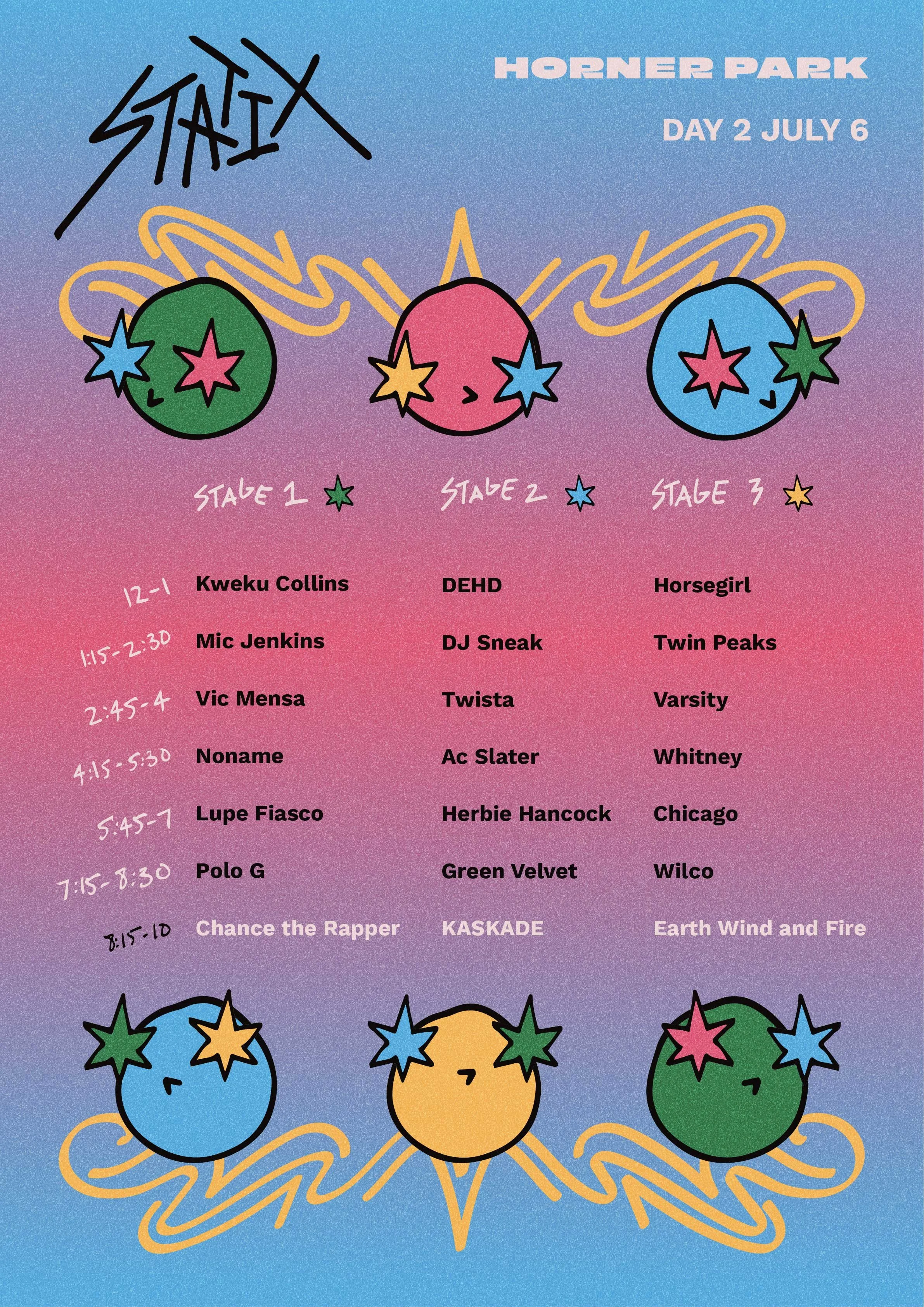
LINEUP POSTER
DAILY SCHEDULES
FLYERS
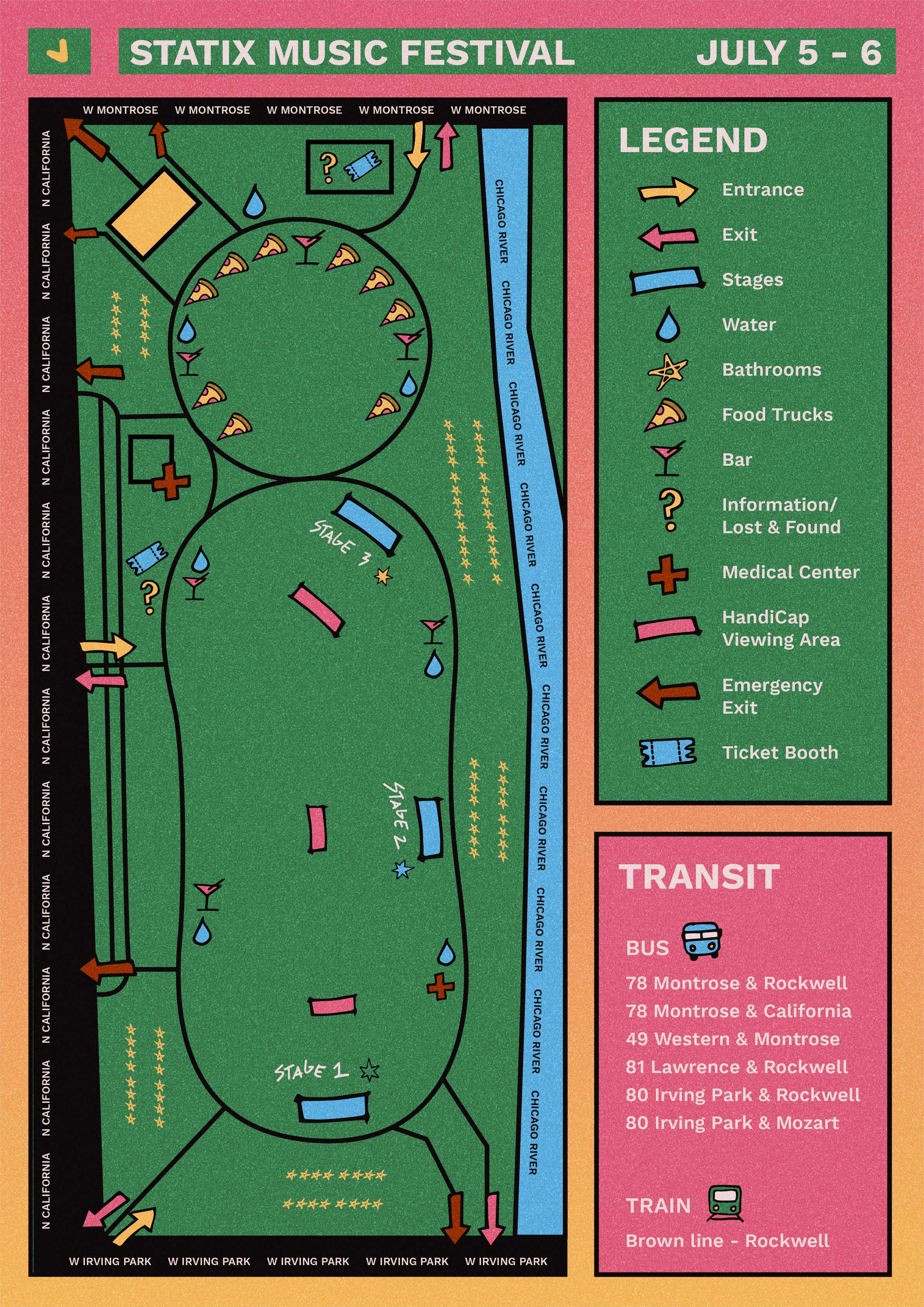
GROUNDS MAP
BANNERS
ANIMATION
Adobe AfterEffects
SOCIAL MEDIA
MERCHANDISE
WHAT STATIX IS ALL ABOUT
RESEARCH
Feel free to zoom or move the board around to see my research
*or click here to view the board in MIRO
LOGO PROCESS
I wanted to create a logo that was fun, versatile, and interactive.
The oversized eyes were perfectly fitting for my festival, enhancing experiences. I made the eyes into the Chicago star so the intention is never lost.
I wanted to give my logo character the ability to change orientation, making it feel more alive. This also can give more focus to certain information within my designs depending on the orientation.
I first hand drew all the different orientations, but they were not very cohesive. So I decided to create some standard heads as well as eyes, then bring them into Illustrator.
This led to the creation of more characters that I can continue to build upon.


